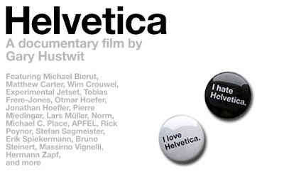
 In Beginning Media Arts, we watched a documentary on Helvetica by Gary Hustwit. This documentary was made in Amsterdam, NY. Helvetica is a commonly used font and is known as the typeface os socialism. This typeface was created in 1957, but it had an original name. Before they had computers to create this font, they used cold type. Cold type was basically a procedure of printing fonts, by hand. They used steel letters, put ink on the letters, and rolled a sheet of paper over it to make the print. It is said today, that Helvetica is seen almost everywhere you go. People use this font because it is simple and readable. It is used in advertisements, store names, titles of books, on buildings, etc. A comment from an interview in the documentary was, "The more you see it, the more the public sees it, the more designers use it." Another comment made was, "Helvetica is a perfect balance of push and pull." I just thought these comments were interesting because I felt that I saw and understood the point they're trying to make.
Tuesday, November 9, 2010
Helvetica
 In Beginning Media Arts, we watched a documentary on Helvetica by Gary Hustwit. This documentary was made in Amsterdam, NY. Helvetica is a commonly used font and is known as the typeface os socialism. This typeface was created in 1957, but it had an original name. Before they had computers to create this font, they used cold type. Cold type was basically a procedure of printing fonts, by hand. They used steel letters, put ink on the letters, and rolled a sheet of paper over it to make the print. It is said today, that Helvetica is seen almost everywhere you go. People use this font because it is simple and readable. It is used in advertisements, store names, titles of books, on buildings, etc. A comment from an interview in the documentary was, "The more you see it, the more the public sees it, the more designers use it." Another comment made was, "Helvetica is a perfect balance of push and pull." I just thought these comments were interesting because I felt that I saw and understood the point they're trying to make.
Monday, November 1, 2010
Subscribe to:
Comments (Atom)