My name is Mai Yer Chang. Back in the days, I’ve always wanted to be a photographer as I was growing up. I’d always take pictures, but I never took good and satisfying pictures. They weren’t interesting and they didn’t stand out. I wanted people to see what I see, so I figured that taking pictures that show something interesting would be a great idea. I think that we all need to realize that everyone has their own imaginations and abstract minds. I’ve finally realized that, after seeing other student’s, everyone tries to find the best and most interesting way to express themselves.
So, as a beginner at photography, I had no clue what was right or wrong to do. I’m one of those people who like to tilt the camera at different angles. I just always thought that it looked nice, and that it was what photographers do, but I was wrong. I learned that it makes the photo look non-professional. Either you hold the camera horizontally or vertically, not diagonally! It’s a big no-no. One thing I did that I knew would make me successful in photography was the rule of thirds. I learned about it from art, and used it as a reference in my photography. It sets an even and better view, especially for landscapes.
Having good lighting in a photo was what I always attempted to do. I learned about different lightings. There’s natural lighting, artificial lighting, etc. I used a lot of natural lighting in my photography, because I like bright pictures; it brings a good mood to the person looking at the photo. When I’m indoors, I use artificial lighting. Our house doesn’t have that much lighting from outside, so I use lamps to do my lighting. One thing that helped me learn about better lighting was looking at Annie Leibovitz’s photos. She uses really good lighting and she knows which angle would create the perfect picture. I also like how she uses both natural and artificial light.
Adobe Photoshop… I’ve heard about it, but have never used it. It’s a program with lots of tools you can use to edit photos. There’s a variety from cloning tools, paint bucket, blur tool, magic wand, desaturating/saturating effect, adding text, etc. to adjusting the brightness and contrast, adding noise to a photo, lighting effects, and EVERYTHING; you name it. It’s an amazing program that I recommend other to use. It’s fun, pretty decent, not hard to use. It creates a whole new look to a dull photo, believe it or not!
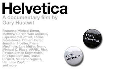
After watching a video called Helvetica, I definitely learned a lot about typography. I like the creations that are made, simply by taking a few words and slapping it onto an image. The photo may be boring, but you can use Adobe Photoshop to create a better look, then add on words from poems, stories, or make up our own words. It could definitely change the way people view the photo. It’s very interesting how you can combine words and images to make others visual and think a lot about why that person decided to combine those two things together. Also, I realized that I have a tiny habit of trying to interpret the feeling behind a person’s typography photo.
This yea has been great! I learned many steps to taking a perfect picture. In a few months, I feel like I’ve accomplished something big. Now, I feel more confident in taking pictures, and feeling good about it. I hope to find myself taking more pictures in the future. I want to show others how much I’ve improved in my photography skills. It’s all based on you and your creativity. Everyone starts from scratch, and grows as time goes by. All you have to do is put a little time into what you do, and you’ll succeed.
MYC Photography :)
Friday, January 28, 2011
Thursday, January 6, 2011
Annie Leibovitz - Life Through A Lens
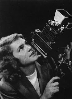
Above is a picture of Annie Leibovitz, an amazing and inspiring photographer.
Annie Leibovitz was born in 1949 in Waterbury, Connecticut. As she enrolled in San Francisco Art Institute, she wanted to study painting. After a summer trip to Japan with her mother, she figured that she was more interested in photography. She started taking night classes in photography afterwards. In 1970, Annie met Jann Wenner, the founding editor of Rolling Stone, and impressed him with her portfolio. After two years with Rolling Stone, she was named the Rolling Stone chief photographer.
Leibovitz was only taught black-and-white photography in school, and she didn't know anything about lighting. When magazines started printing in color in 1974, she had to learn about color by herself since she worked mostly with black-and-white photography. Annie also traveled a lot. She took many photos of celebrities and politics, and that caught attention of magazine businesses. Her pictures appeared in Vogue, Vanity Fair, The New York Times, and also in ad campaigns for American express, the Gap, and the Milk Board. Leibovitz's photos caught people's eye because she was a daring and innovative photographer. She's also very creative with what she does.
Below, are some of the photos taken by Annie Leibovitz that caught my attention:
The crowded mind of Johnny Depp
I like this photo because the room sets a gloomy mood and the colors create a calm feeling. The room is also old and it looks abandoned. Johnny Depp fits in the photo perfectly because of his clothing. His hair color and the way he's sitting on the wooden table shows his mood.
Earth Angels: Robert F. Kennedy Jr., George Clooney, Julia Roberts, and Al Gore
I like the color of this photo. I also like the set up, how Julia Roberts is standing and how her dress is a nice shade of green that stands out from the wall. The clothes that the guys are wearing also goes along with the theme of Earth.
Wizard of Oz
This photo has a nice use of color. I really like how Keira Knightly is in a white dress. It makes her the focal point and she really stands out. I also like the setting of this photo. The dark ocean along with the dark sky creates that sense of danger and fear.
Friday, December 3, 2010
Tuesday, November 9, 2010
Helvetica
 In Beginning Media Arts, we watched a documentary on Helvetica by Gary Hustwit. This documentary was made in Amsterdam, NY. Helvetica is a commonly used font and is known as the typeface os socialism. This typeface was created in 1957, but it had an original name. Before they had computers to create this font, they used cold type. Cold type was basically a procedure of printing fonts, by hand. They used steel letters, put ink on the letters, and rolled a sheet of paper over it to make the print. It is said today, that Helvetica is seen almost everywhere you go. People use this font because it is simple and readable. It is used in advertisements, store names, titles of books, on buildings, etc. A comment from an interview in the documentary was, "The more you see it, the more the public sees it, the more designers use it." Another comment made was, "Helvetica is a perfect balance of push and pull." I just thought these comments were interesting because I felt that I saw and understood the point they're trying to make.
Monday, November 1, 2010
Tuesday, October 5, 2010
Maragret Bourke-White
MARGARET BOURKE-WHITE
(June 14, 1904 - August 27, 1971)
 For my project, I am going to pay homage to Margaret Bourke-White. To pay homage is to give acknowledgment or consideration for someone's work. Margaret was an American photographer and photo journalist. She was born in the Bronx, New York. Margaret grew up in Bound Brook, New Jersey. Bourke-White began studying herpetology at Columbia University in 1922. After studying under Clarence White, she developed an interest of photography. Margaret switched colleges several times, but she finally graduated from Cornell University in 1927. She moved to Cleveland, Ohio a year later, and became an industrial photographer at the Otis Steel Company. A few years later, Henry Luce hired Margaret as the first female photo journalist for Life Magazine. During the mid-1930s, Margaret photographed victims of the Dust Bowl. Together, Bourke-White and her husband Erskine Caldwell collaborated on You Have Seen Their Faces (1937). She was the first woman allowed to work in the combat zones during the World War II. Afters years of amazing photography by Margaret Bourke-White, she was diagnosed with Parkinson's disease and died in Connecticut.
Friday, September 17, 2010
American Photography History
The Brownie Camera (1900-1934)
Photographs in the early days were a matter of life and death. Before the Brownie camera was created, people only took pictures once or twice in their lives. Brownie cameras were sold for $1.00. A quarter of a million brownie cameras were sold within a one year.
Photographers used pictures to show social change. Pictures were also used to attract attention in newspapers and magazine. Fashion photography created the way people wanted to look. The pictures of woman in beautiful dresses made the readers want that look. Photography had an influence on what people believed. Although the television was invented, photography was still "king". Also, photography is the best media out there because it shows emotions and many other feelings of the person(s) in the picture.
Subscribe to:
Comments (Atom)


